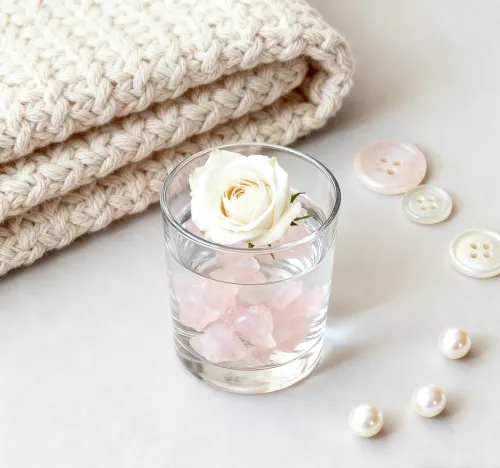
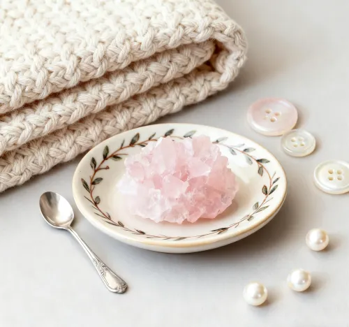
Let's talk about that gentle blush-hued crystal sitting on your desk—rose quartz seems simple enough at first glance, doesn't it? You might pair it with basic pinks out of habit, throw on a random ribbon for gift wrapping... and then wonder why the whole presentation feels slightly off. Well, maybe it’s not exactly that you've chosen wrong colors, but that you haven’t discovered how materials and shades converse with each other. At some point, we’ve all held a rose quartz piece against a ribbon and sensed that something wasn’t quite singing. The thing is, these mineral tones have unique personalities—soft yet luminous, delicate but depth-rich. Anyway, when harmonized intentionally, rose quartz transforms from a pretty stone into a storytelling centerpiece that subtly elevates spaces, gifts, or personal adornments. It’s about hearing the quiet dialogue between textures and tints—ready to discover how?
Paths in This Exploration
- Harmonizing Color Combinations
- Ribbon Material and Texture Pairings
- Implementing in Visual Design
- Achieving Balanced Aesthetics
- Long-Term Style Adaptability
- Cultural and Seasonal Variations
Harmonizing Color Combinations
Imagine draping rose quartz across a dusty mauve cloth—suddenly, that mild pink stone reveals hidden warmth. This organic chemistry happens through analogous pairings, often found at 160-170° contrasts on the color wheel. Muted sage greens or lavender palettes can tease out rose quartz’s complexity while maintaining serenity.
When you explore monochromatic schemes, gradients spanning HEX #F7CAC9 to #D8A1A4 create seamless flow. Dusty pink ribbons harmonize beautifully here, letting crystal veins guide the eye naturally without overwhelming the senses. Cool-toned ivories prevent clashes too, offering quiet background neutrality—quite like letting quartz be the main speaker in a visual conversation.
Ribbon Material and Texture Pairings
Touch matters as much as tint. Run your fingers across satin ribbon near lamplight: notice how light skims its surface at 15-20° angles? That reflective glow amplifies rose quartz’s cloudy translucence, almost like they’re sharing luminous secrets.
The thing is, texture creates dialogue. Velvet-textured ribbons drink in light, forming a plush tactile contrast against the quartz’s polished hardness. Meanwhile, sheer organza gifts depth through layering—when wrapped around a rose quartz pillar candle, quartz undertones glow through the fabric like dawn light. For chunky stone pieces, wider grosgrain ribbons (over 38mm) provide proportional balance.
Implementing in Visual Design
Let’s move ideas into reality. You’re styling a vanity tray—how do you make rose quartz compacts sing alongside other trinkets? Start with taupe or greige surfaces. These neutrals boost rosestone prominence by 25-30%, letting it claim focus amidst clutter. Draped ribbons become strategic connectors rather than mere decorations.
Centerpiece Construction
Curate with restraint. Triadic palettes can unite rose quartz with buttery yellows and soft aquas through geometric arrangements. Place ribbons not randomly, but as directional guides—perhaps folding a velvet ribbon beneath quartz bookends to lead sightlines toward the main piece.
Achieving Balanced Aesthetics
Ever notice why some arrangements feel "just right"? It’s textural rhythm. Imagine placing glossy rose quartz clusters among matte and translucent ceramic accents—each finish claims its own voice without chaos. Ribbons can serve as unifying threads.
Anyway, metallic accents matter carefully. Antique brass or champagne gold ribbons inject subtle warmth—never distracting from, but elevating quartz’s soft essence. Delicate silver embroidery along a ribbon edge? That whispers refinement against quartz facets.
Long-Term Style Adaptability
Great design endures. Opt for UV-resistant polyester ribbons when styling sunlit quartz displays—your combinations won’t yellow or fade halfway through summer. Knotting techniques with wired-edge ribbons preserve structural integrity year after year.
Double-faced silk ribbons offer viewing-angle consistency from 0-180°. Reversible ribbons with coordinating hues adapt effortlessly—deep mauve in winter flips to sea-glass green for spring, both companionable with quartz’s flexibility.
Suggested Explorations
Try pairing the same rose quartz piece with five ribbon textures this week—record how velvet feels in autumn dusk versus glossy satin in morning light. Notice which combinations whisper tranquility versus joyful surprise.
Cultural and Seasonal Variations
Colors breathe differently across cultures. In Eastern traditions, pairing rose quartz with red-tasseled ribbons symbolizes harmony—in Western styling, blush-and-green palettes echo cottage gardens. Ombré ribbons shifting from rose quartz hues to crisp pearl white capture seasonal transitions elegantly.
Monochromatic textural variations gain holiday significance too—matte winter ribbons versus glowing summer organza can shift energies. At some point, you’ll notice traditions inspiring your own adaptations. The beauty? Rose quartz embraces them all.